2D Motion Design and Cosmetics: Animated Typography as a Brand Weapon
Luxury cosmetics has always had a special relationship with the graphic sign. Before selling a cream or a lipstick, a house sells a logotype, a colour, a way of cutting space. 2D motion design did not change that logic. It amplified it to saturation — and the brands that understood this dominate the feeds.
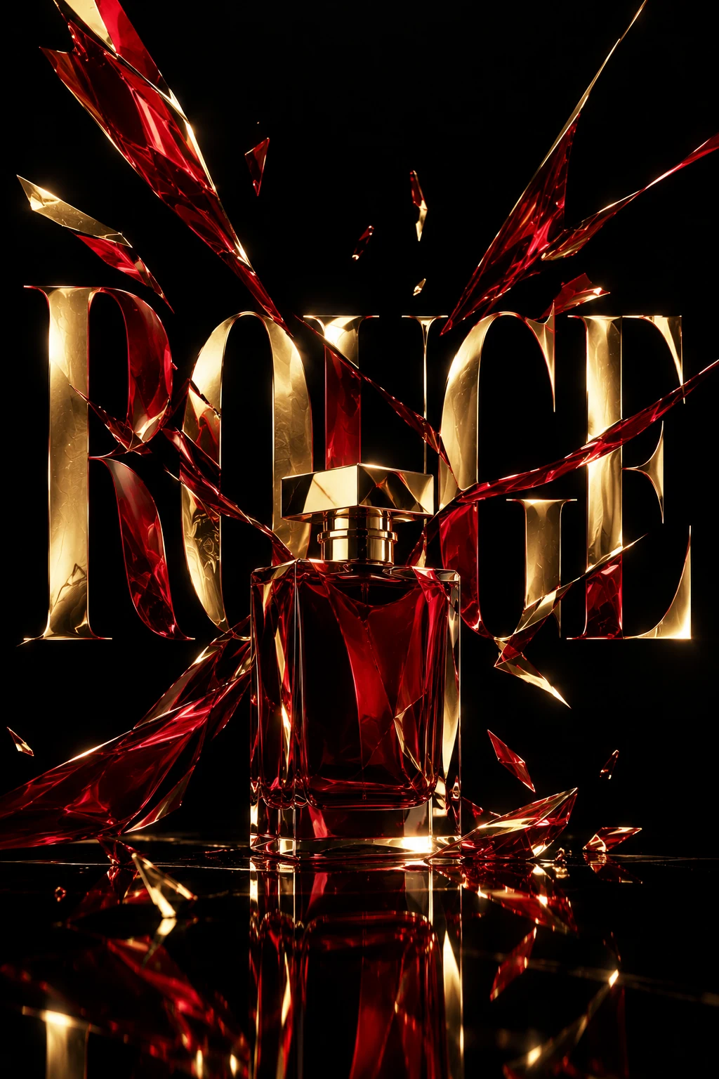
When the product disappears behind the gesture
Look at a 2024 YSL Beauty campaign. Then look at a Chanel campaign from the same year. You are not looking at two brands selling cosmetics. You are looking at two philosophies of movement. YSL: aggressively geometric typography, hard cuts, deliberately saturated colours. Chanel: breathing space, typography that glides in, dominant white, movement as the absence of movement.
2D motion design has become the main vehicle of brand differentiation in cosmetics. Not photography — now too easy to copy, too easily reduced to stock. Not the celebrity ambassador — shared among ten competitors. Movement: the way a letter enters the frame, the speed at which a flat colour is revealed. That is what cannot be imitated, what cannot be stolen without immediately being recognised as plagiarism.
Designing with eyes closed: sound-off design
Most videos on Instagram are watched without sound. That fact should be posted in large type in every motion design studio working for beauty. Designing a cosmetics animation means, first of all, designing for silence. This constraint is compounded by mobile formats, as we analysed for fashion art direction in 9:16. Visual rhythm — the cadence of cuts, the synchronisation of typographic entrances, the breathing between elements — must replace what music would normally do in the viewer's perception.
This implies a radically different approach to easing. In a world with sound, softer transitions are possible because the musical rhythm carries perception. Without sound, every micro-animation must signal its own energy. Interpolation curves become narrative decisions: a creamy ease-in-out communicates luxury; a brutal ease-in with overshoot communicates urgency, youth, disruption.
After Effects remains the reference environment for this kind of production, but the use of expressions — in particular animation rigs driven by control sliders — makes it possible to deliver modular systems to the houses' in-house teams. A well-built rig is a motion art direction the brand can apply itself. It is one of the key points detailed in my complete guide to being a freelance motion designer in 2026.
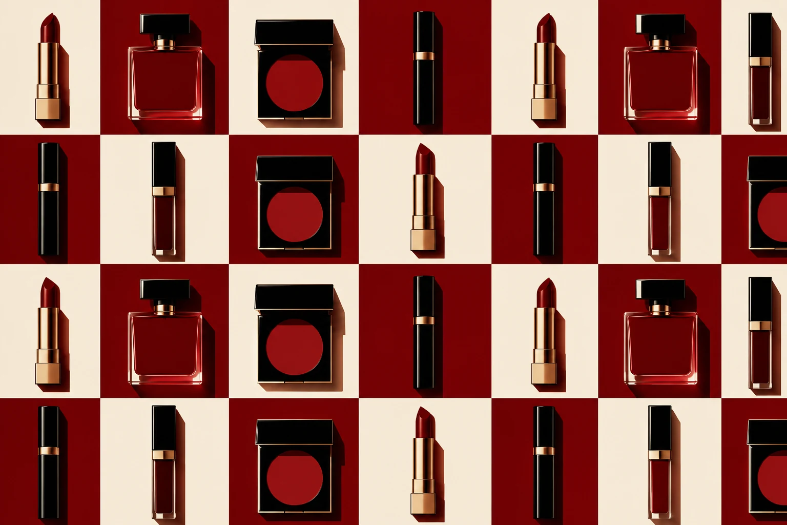
Brand guidelines as creative material
Working within the brand guidelines of a great cosmetics house is not a constraint to endure. It is a playing field. The best motion work for beauty emerges precisely from the tension between the brand's immutable rules — proprietary Pantone colour, font weights forbidden below a certain threshold, minimum spacing between elements — and the creativity of the motion designer who pushes them to their limit without breaking them.
Lancôme's guidelines forbid overly strong contrasts. NARS allows almost anything. Dior Beauty has a very specific relationship with the diagonal. Knowing these rules before the first brief, having absorbed them as second nature, is what distinguishes the specialised freelancer from the generalist who has to learn the house's language on production time.
- 01Adobe After Effects Animation Framework[ www.adobe.com ]
- 02LottieFiles Web & Mobile Interactive Animation Specs[ lottiefiles.com ]
- 03W3C Web Animations Working Group Specification[ www.w3.org ]
Looking for a trusted art director and motion designer for your project?